Web design for a platform about the energy transition
The project includes website (desktop & mobile concept and templates) as well as desktop application development
Case study introduction:
The product: A wed design for finding and viewing information online about the energy transition.
The problem: The energy transition is one of the greatest social, economic and ecological challenges of our time. This topic is of paramount importance not only for current generations, but also for future ones. Our contribution to the society begins and ends with our actions. On a personal level there are many things someone can do and for this reason, one needs to be well-informed and take responsible actions.
As a person who has worked for 2,5 years in such a platform, I am convinced that knowledge about the energy transition helps to overcome every possible hurdle of the climate crisis. Accompanying people on their journey to a personal energy transition is an act of informing, advising and offering suitable services.
The goal: Building an online Academy where someone can be part of a bigger community who wants to help with the environmental issues, is the purpose of this project. Additional features are to be examined, as well. For example: books, tutorials, blogs, starting conversations, arranging group meetings, initiating public speeches etc. The business model is based on paid subscription for the members who wish to have access to elaborated features and interactions. A basic subscription offers a simple but tempting to upgrade subscription membership.
My role: Concept, Research, Wireframes, Visuals, Product Development
Programs used for the realization of this project: Figma, Illustrator, XD, Photoshop, Confluence for project management
Foundational Research
The product development life cycle consists of these stages: Brainstorming 〰️Define 〰️ Design 〰️ Test 〰️Launch and Update frequently!
For the exciting phase of brainstorming a lot of research is required. The intention is to create a usable, equitable, enjoyable and useful product, therefore planing needs to play a big role in the design process. The design process was divided in design sprints and the first one is about conducting user research.
This design sprint requires talking with colleagues, industry experts, and existing users. It is extremely important to understand and find out the most about what people think, act, feel and do about the topic of energy transition.
Conducting interviews before creating empathy maps
What do I need to know about users and their community to understand their experiences?
What are the processes, practices, and emotions that people experience around the problem I am trying to solve? How have these things changed over time, and why?
What are the problems that users still have not solved, as they relate to the product you're designing? What would solving those problems do for users and others?
How will the product I am designing function within users’ lives?
Those where the questions I had researched before the interviews of 8 people took place. I made sure to ask open-ended questions, and tried to document observations about those participants.
Empathy maps are easily understood charts that explain everything designers have learned about a type of user. It is an important step before creating the buyer personas who will then appear to be at different phases of the customer journey.
Buyer persona development
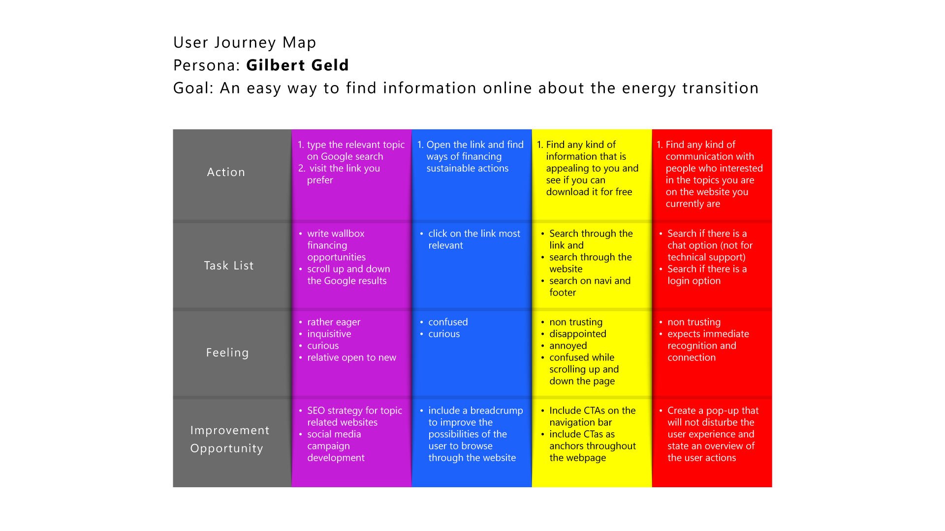
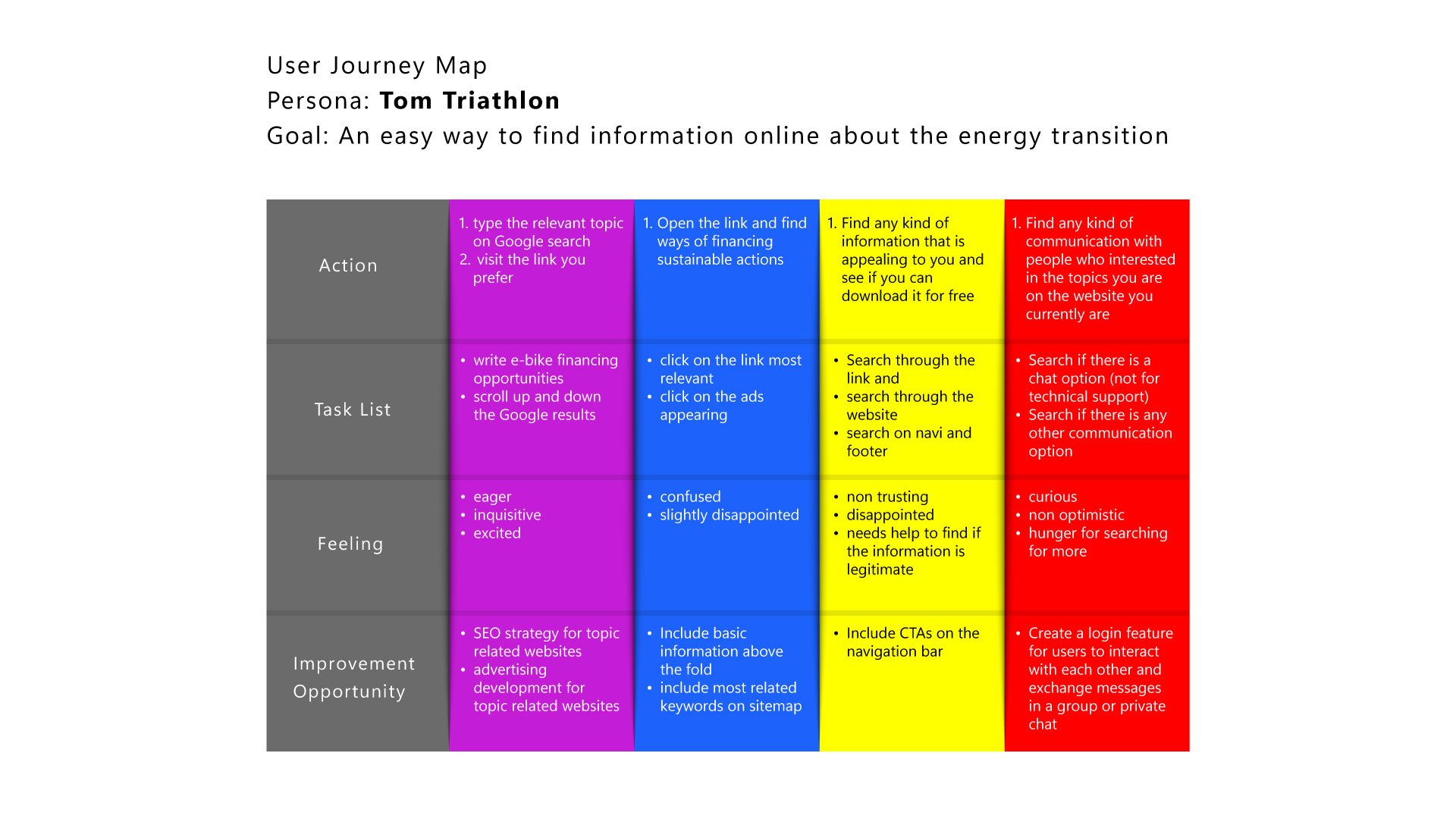
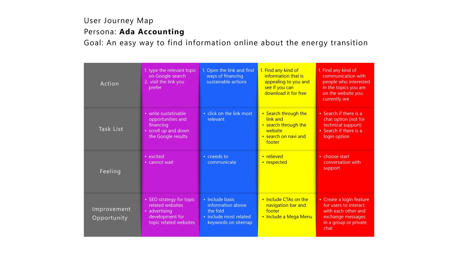
Before a User Journey we need a User Journey Map
A great user experience includes obstacle-free paths for the users. In fact happy paths that benefit first and foremost the users and therefore the stakeholders is the ultimate goal. At this stage of design process, it is also where pain points are being highlighted, together with improvement opportunities that could help shape the new product.
From the designer’s perspective, it is also important to reduce the impact of the bias. At this point of the process and all along the product development stages.
Confirmation bias, false concensus bias, primacy bias, recency bias, implicit bias and the sunk cost fallacy. These are the commonly used bias in user research. In detail, there are preconceptions and looking for verification bias (confirmation bias), people tend to agree with the statement that was given from the first and last person (primacy bias), whereas the recency bias talks about how people tent to remember what was stated the last. Implicit bias is the fact of feeling uncomfortable when the interviewer is with people who have different backgrounds and experiences. 1 or 2 people do not represent a satisfactory area to provide results and possible solutions to user needs (false consensus bias) and a strong one is the sunk cost fallacy, something I have faced personally many times. It has occurred to me that I was so much into a project that was failing but I did not want to let go of it.
Having in mind those biases is a good start. Reminding those biases through the process it is a recurring and a reassuring process that they will not affect any part of the process.
Note taking is also something that offers a way of avoiding getting influenced.
In the past, I was aware of the mistakes right after I was making them. I still had time to go back and rephrase or even let the participants take over without interrupting them. For moderated usability tests it was easier to slip on those mistakes. For unmoderated ones, I figured it was a good compromise to find the most honest opinion on the results of the interaction with the product being developed.
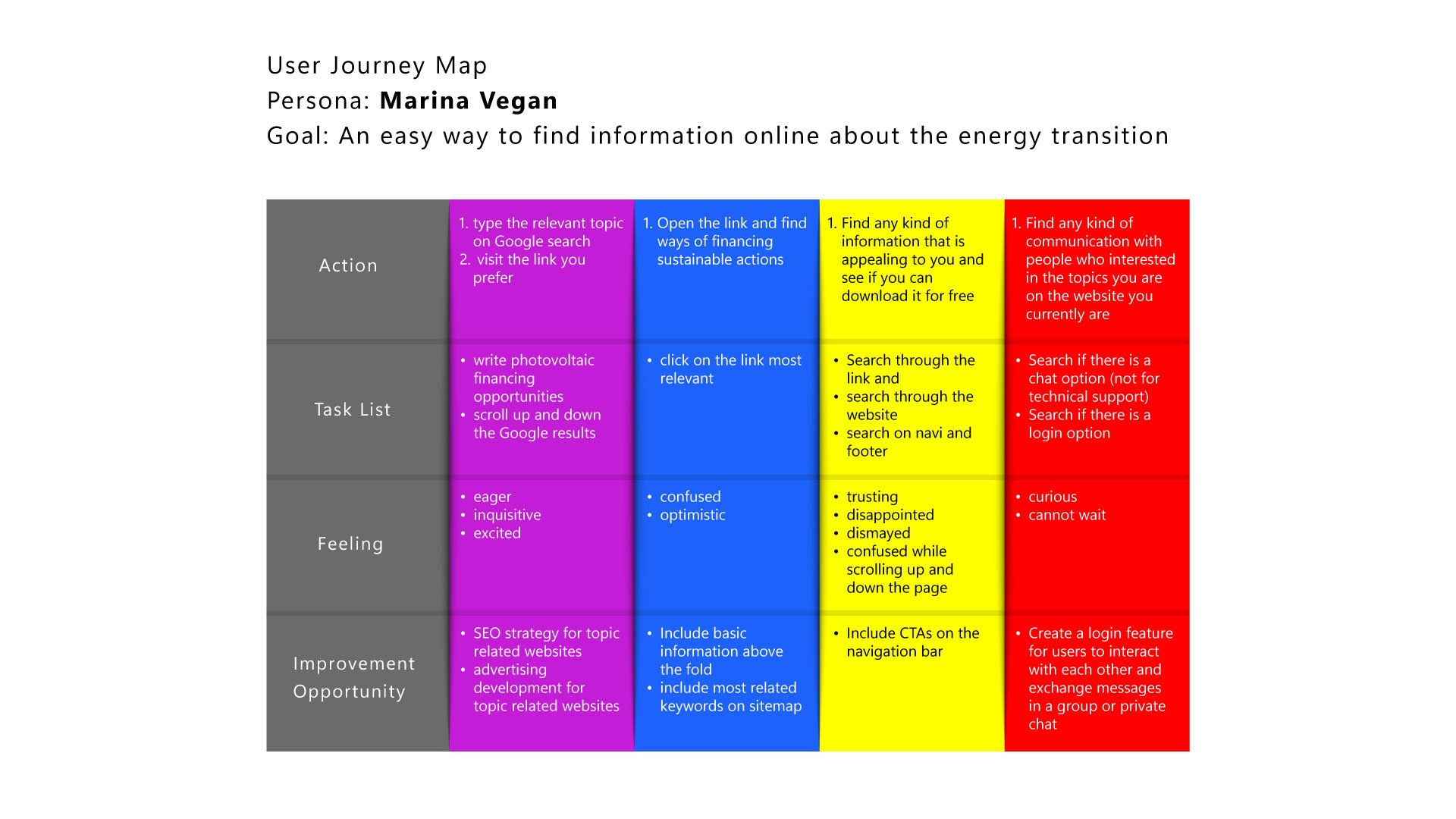
Persona: Marina Vegan
Problem statement: Marina Vegan is a busy young adult who wants to find a way to contribute to the environment. She thinks that energy saving tips could be the start of her journey to the energy transition. She also wants to be an advocate for her peers.
Persona: Gilbert Geld
Problem statement: Gilbert Geld is a married man who wishes to improve his financial investments. He sees opportunities like having a photovoltaic on his roof and a wallbox at his garage ways to save him money and increase the value of his house. He wishes to interact with people who know about those topics.
Persona: Tom Triathlon
Problem statement: Tom Triathlon is a business man who has also a family. He needs to invest on the energy transition for him and his family because he sees the environmental crisis as a severe issue and also he needs to cut down the expenses of his household.
Persona: Ada Accounting
Problem statement: Ada Accounting is a woman who is always there for her family. She needs to learn more about sustainable energy resources and daily life tips to improve the quality of her life and family and to spend less money on energy for her house.
Competitive Audit
At this point, a competitive audit report needs to be conducted. It is important to learn about websites that are similar to the one under construction for various reasons. First and foremost an existing website could already be solving some of the user problems identified earlier. If that proves to be the case, new features can shape up the website, since learnings can provide important iteration opportunities. UI inspiration is also in the play, while the competitors’ user flows highlight the important steps the users need to take when they decide to consume their products.
The results of the research were that only a few organizations offer the possibility of an online academy on this topic of energy transition. That gives plenty of room for discovery and for brainstorming about enhancing this product. Indirect competitors are all the universities who offer certificates, diplomas and degrees on the topic of sustainability, renewable energy, climate change and energy efficiency. There were organizations supported by governments and donations but this is not the scope of this project.
This project is about designing a solution for people who wish to be educated about the energy transition, communicate and collaborate on a community level, start their own initiatives through this platform and be active members because there is fresh information coming and something new about the climate is happening every day. The membership would be free at the beginning with limited access to the library, whereas the premium members can have access to a bigger amount of sources and whitepapers. Could it be a great feature for an existing company that offers photovoltaic solutions for example? Sure. Could it be a successful business model for a company? Let us explore this together:
Why could this academy be a profitable business model?
Because pipelines are becoming platforms!
Platform businesses are disrupting the traditional business landscape in a number of ways: they displace big firms, they transform familiar business processes like value creation and consumer behavior, while they change the structure of major industries.
Pipeline businesses like Nike have traditionally scaled by owning upstream suppliers or downstream distributors. This is the so-called vertical integration. Others expand by widening the pipeline to push more value through it. This is referred to as horizontal integration (like companies which grow by creating new products and brands).
In the world of platforms, the internet no longer acts merely as a distribution channel, as a pipeline. It also acts as a creation infrastructure and a coordination mechanism. Platforms are leveraging this new capability to create entirely new business models.
Attention, influence, reputation are the currencies on this platform. And they will become valuable because of the communities that participate in their platforms. In fact, in the world of network effects, ecosystems of users are the new source of competitive advantage and market dominance. Where to start? Seek to reinforce positive network effects by creating and strengthening as many positive feedback loops as possible.
Another idea? Curate members of an existing user group to create a new category of users. Take the example of LinkedIn, who designated certain participants as “thought leaders“ and invited them to become producers of informational posts.
A simpler example? The weekly ladies’ night where female customers get discounted drinks (Market A) and the male customers happily pay full price (Market B), while they are driven to enter the bar because the women are already there.
Brainstorming of Ideas - where to start?
There are so many ideation techniques. Mind mapping, reverse thinking, storyboarding, daydreaming, role play, analogies, the idea of mixing up worlds so that you come up with the idea that excites the user the most.
The "How might we" exercise.
"How" encourages us to explore a bunch of ideas instead of moving forward with only one idea for solution. The word "how" suggests that we don't have an answer yet. "Might" emphasizes the open-endlessness of the brainstorming solution. Our ideas are possible solutions and not the only solution. And finally, the word "we" suggests a collaborative effort. Ideas that are thorough and innovative require teamwork to complete. The question should be specific in describing the needs of the user, but still have room for innovation in the final product. This means that the question is broad enough to leave space for solutions that might not be evident yet.
There are so many ways to reframe the current problem:
• How might we design a scalable tool to help people with their energy transition?
• How might we design a system that keeps track of all the learning path of the users?
• How might we allow users to anticipate new courses?
• How might we make the users stick to their commitment?
• How might we make the users to enroll to many courses?
• How might we make the users to share the website to their peers?
• How might we make the users participate into conversations with each other?
• How might we increase the number of premium subscriptions?
The freedom that one feels is amazing, while with the team collaboration one gets stronger connected. And then comes reality: is the idea feasible? Is it technically possible to build? Does it solve the users’ problems? Is it financially beneficial? Is it viable? Is it desirable?
No one can predict the answers to all these questions 100% correctly, but, there is always the usability studies that offer the most insights to the people involved in the project. Among other factors, user-centered design is the closest chance we can have to success.
Effective information architecture is key to creating a seamless user journey. Knowing the users, their goals, and their behaviors is really important for creating an effective IA. Why is creating information architecture an important part of UX design? First, IA can organize and define the structure for the website. An organized website is easy to navigate. Also, IA can provide a high-level view of a product. Understanding how the elements for a website fit together and relate to each other can improve the whole design process.
It’s nearly impossible to create a good user experience without a solid information architecture foundation
Paper wireframes
When designing websites, it's key to organize elements in a way that welcomes users and guides them as they navigate each page. A layout is the structure that supports how visual components on a page are arranged, like images, text, and icons. Common website structures are: hierarchical, sequential, matrix, database. Depending on the product, the website follows a layout but in most cases there is a mixture of it.
Hi-fi Prototype before Usabitily Testing
Assistive Technology: how to ensure that people using it have a great user experience
While in the process of creating digital wireframes for the website, it's important to keep accessibility considerations top of mind.
Users of all abilities, identities, and experiences need to be able to successfully move through the design. Even better, they need to find happy paths in it. Therefore, understanding how people with disabilities use the product is a crucial part of the UX design process. There are a few features to include in the wireframes to ensure that people using assistive technology have a great user experience.
Headings are titles or subtitles that stand out at the beginning of a paragraph, article, section, or another area of a website. Header text is often larger than the text on the rest of a page and designates the beginning of a section. All users can benefit from headings. Efficient navigation for users of screen readers and visual hierarchy are the most important issues here.
Another important feature to include is landmarks. Landmarks are features used to map out regions of an interface. Common landmarks include navigation bars, search boxes, fixed sidebars, and footers.
Initial focus is how you attract a user's attention to help them accomplish a task.
The idea behind the initial focus isn't just to attract the user's attention; focus can also help define the primary tasks or actions we want the user to take. In general, the less clutter there is on a webpage, the easier the interface is to navigate. Otherwise, a user might experience cognitive overload, too much information, or too many tasks simultaneously, resulting in the user not being able to complete the task.
Gestalt Principles
This beautiful German word describes how human group similar elements, recognize patterns, and simplify complex images when we perceive objects. The way that the hierarchy of the page is organized it should not only be visually pleasing but also easy to comprehend. Basically, humans naturally notice the whole of something before noticing the parts. We do this in order to mentally connect the dots between separate objects and create a cohesive story in our minds.
There are quite a few principles like similarity, proximity, common region, visual balance, symmetry, closure.
Let us examine together the principles that are being utilized in the wireframes presented above.
A Gestalt Principle that's particularly relevant to our wireframes is similarity. Similarity means that elements that look similar are perceived to have the same function. Elements might look similar based on their shape, size, or color.
We cannot examine color at a great extend at this point, since only shades of the same color are in use. In both the desktop and mobile wireframes there are no distinguished separators among the different sections of the website. The user has an idea of different content because he perceives the similar elements close to each other.
A second Gestalt Principle that can help inform our wireframes: proximity. Proximity is the perception that elements that are close together appear to be more related than those that are spaced apart.
Like already mentioned, there are similar elements used throughout the wireframes. For example, the team members are listed together, and they show the same kinds of information. At the Glossary overview page, the user has the possibility to browse through the different terms and they are all close together even though the explanation text is of different length.
And that brings us to the principle of common region that is used on those wireframes, which states that elements located within the same area are perceived to be grouped together.
Are the wireframes ready for a Usability Test?
Prototypes are designed to test how well users can complete specific tasks in a simulated activity, so it’s important to be specific about which types of interactions we’d like to build into the prototype. The question now is where to focus on for the interactions in the prototype. To answer to this we need to answer a series of questions:
Are the wireframes are connected in a simulated navigational flow?
Users can proceed forward and backward within the flow?
Users can enter the flow from different starting points?
Cues for navigation are clearly indicated?
Is successful completion of the simulated activity clearly indicated?
Are users returned to an origin point after successfully completing the simulated activity?
Coming back to the scope of the project, we need to remember that we want the users to take the following actions: enroll to a course, update from Basic to Premium membership, subscribe to the newsletter, interact with the community members, read a blog post.
Cross-checking those actions, they are not represented on the wireframe, as a result the wireframes are not ready for the next stage of the process: usability testing. That is why the below wireframes are a rework:
Usability Testing
For the sake of resources, it was decided that both the website and the dashboard were tested by a group of users. The mobile wireframes do not include the dashboard, which is the dedicated area for the actual learning on purpose. In fact, the user will be prompt to login from a desktop view for a better user experience. The ultimate purpose of the usability testing is to create a research plan to test the main user flow of the website and get feedback from real users. A research plan is a step-by-step examination of a group of users and their needs.
The UX research plan is made up of seven elements:
• the project background,
• the research goals,
• the detailed research questions,
• the KPIs,
• the methodology,
• the participants
The researcher has to always have in mind one question: how will the results of the research impact the design decisions? Critical are also the results that stakeholders need to know and in specific results concerning the amount of time a user spends on a task, users' use of navigation functionality versus search functionality, user error rates, drop-off rates, conversion rates, and the system usability scale.
Project background:
The scope of the project is to create an academy or else a learning platform for people who are interested in the energy transition. Ultimately after people have access to valuable information on the website they will be willing to subscribe so that they can interact with other users and accumulate certificates. The platform will offer the possibility of affiliate programs, so that the visitors of the website can have offers from them in case they are interested in buying. An active newsletter will work as a hook for the users who do not want to invest in learning for now, but are curious about different topics about the energy transition and how it affects their lives.
Research goals:
1. to determine if users can complete core tasks within the website, such as:
subscribe to the newsletter,
enroll for a course,
go through the dashboard environment,
upgrade to a paid subscription,
interact with other users while on dashboard environment
2. find out the reactions of the users about the content and sections in the website
Research questions:
- At which stage of their buyer journey are the majority of the users? Awareness, consideration, decision?
- Can users find what they are looking for?
- Can users navigate to enrollment? Do they realize that it is free and is this important to them?
- Is the website easy to navigate and how do they find the content?
KPIs:
Use of navigation vs search function and conversion rate.
Methodology:
Moderated usability study, Germany - remote, Sessions took place end of August during afternoons, each session lasted 20 minutes, there was no compensation
Participants:
5 participants, 3 women and 2 men, between the ages of 25 and 45. The study is not accessible for use with a screen reader nor a switch device. The interviewer shared the screen and let the participants interact with the screens.
From observations to insights
After organizing data, one can find themes. Identifying themes or patterns that are common across participants is one key element, but what makes a great researcher is coming up with insights based on the themes. Insight is an observation that helps understand the user or their needs from a new perspective. Insights are grounded in real data and answer the question we set before: how will the results of the research impact the design decisions.
Find the most important observations from the tasks the users were asked to complete about the website, here. Find the notes taken from the usability test for the dashboard here and the remarks from the usability testing for the mobile version here.
An affinity mapping card is important to group the observations.
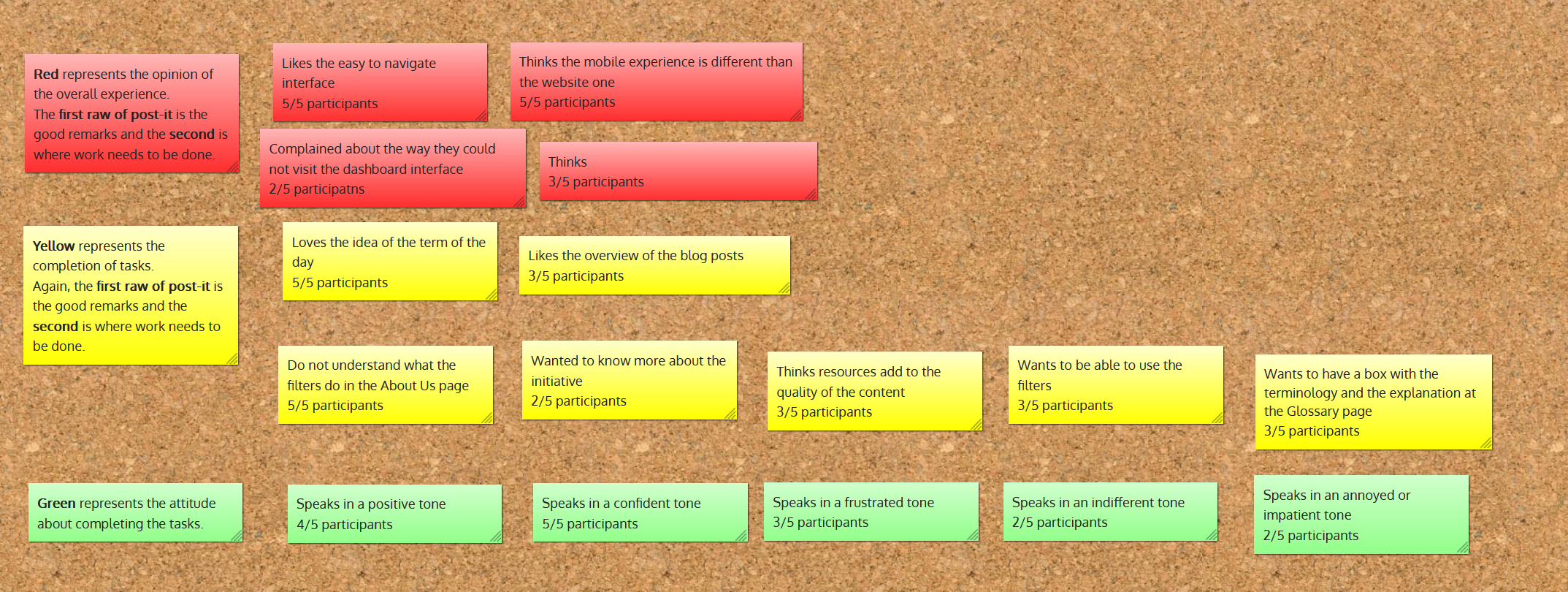
Below is 3 affinity maps containing grouped data from all 5 usability study participants for the 3 occasions. The data has been grouped based on similar participant responses and reactions to usability tasks.
Affinity mapping card for the weBSITE
Affinity mapping card for the desktop application
Affinity mapping card for the mobile version of the website
To keep track of the themes identified from the groupings, it is important to enter them into insights. Below are the ones for the website:
1. Based on the theme that once a user is enrolled has access to features like “upgrade”, “chat with other community members”, “check other members who are active”, an insight is to create a new page with the upgrade benefits and features. This should serve as a sub-menu of the mega menu.
2. Based on the theme that the learning paths do not showcase a lot of information; an insight is to include a few key facts to the learning path cards.
3. Based on the theme that a few courses are for free, and then some more are paid and it is not easily noticed on the webpages, an insight is that in the sub-menu of the mega menu a subcategory of free courses and another subcategory paid courses should be displayed.
From this point, there is a clear action plan and we are ready to present the high fidelity prototype.
Below is the action plan considering the desktop application once the user is logged in.
1. Based on the theme that the “Course“ tab does not include important information about the learning process of the enrolled user, an insight is that assignments, milestones to accomplish, grades and discussions similar to the topic need to be included.
2. Based on the theme that the tab “Events“ includes every aspect for creating an event, except from uploading relevant data, an insight is that options to upload data need to be included.
3. Based on the theme that “Notes“ need to be taken from different parts of the platform, an insight is that notes can have an extra place in the tab where the notes are seen from where the user has taken them.
4. Based on the theme that on the tab about “Threads“, the threads can be overwhelmingly many, an insight is that more filtering options should be included.
5. Based on the them that on the tab about “Settings”, there has to be the possibility to update payment methods, security, notifications and add or subtract widgets, an insight is that those options are included.
Lessons learned
While working on this project, I learned a few things especially regarding my design process and how I could improve as a researcher.
I realized that providing real content on my wireframes made the user understand more or less what they will expect when launching it. Although a test of the lo-fi wireframe makes sense early at the process, the limited time and resources forced me to run a usability test later in the process when the wireframes were more refined. I realized that it would have been a luxury to have the lo-fi tested, especially because this is not just an app.
I also understood a mistake I made after I spend a lot of time on the wireframes. I did not have the user flow in mind. I started designing and before I get to test them, I realized I need to put more work on it, because the basic questions I wanted to check on the test where not covered.
While conducting the moderated tests I realized that the testers wanted to give me the answers I was anticipating for, so I turned off my camera and I stopped commenting really early in the process. The testers have lots of empathy, but they are there to point out happy paths and possible missteps.
Last but not least, I was impressed by the high expectations about the use of the dashboard from the testers. I realized that it was not that important to focus on the basics, but it was the functions that offered a surprise and delight to the users. In fact, I believe that this would be what the next round of tests will require: to enhance the product with more interactive functions.


