Adaptive Mobile App
Fitness app with personal training and meal recommendations
Designing for mobile environment
Mobile design and design for other devices such as laptops and desktops does not mean creating the same digital product, just smaller. It means focusing on what matters to the mobile user and delivering a differentiated user experience. To do this successfully, we need to focus on tasks and how they are executed.
Putting together the dots…
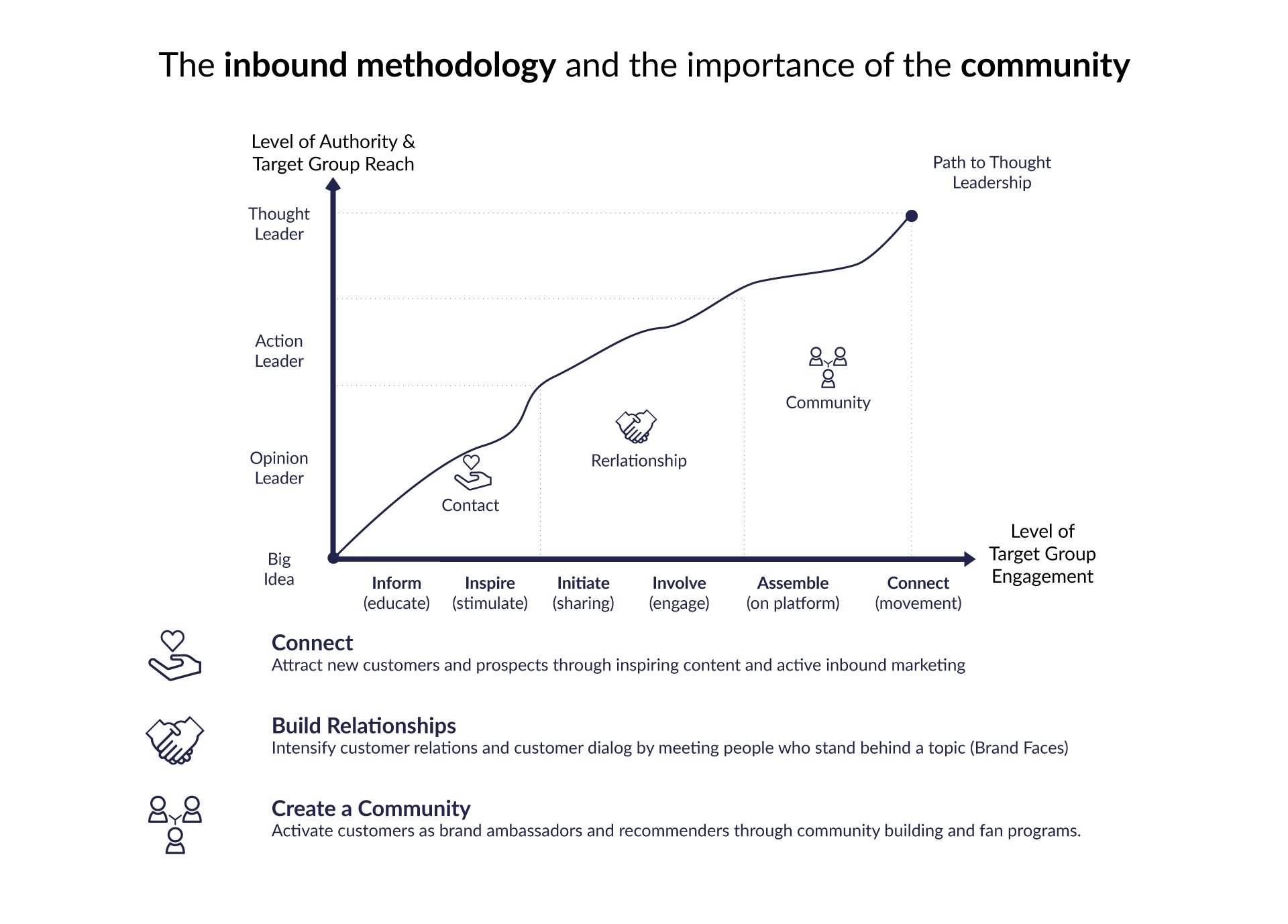
One of the things that fascinates when I am brainstorming is the ability to borrow elements from different worlds and connect them in another way. This is what made me fall in love with marketing and this is why I am currently in the UX business: because we as UX designers try to bridge several worlds connecting those of the users with the business goals all via innovative technology platforms. We have to constantly think as users and never forget that the users are experiencing different touchpoints, which we should always consider. Google introduced a similar theory to the inbound methodology of customer journey in 2015: the Micro-moments. On a similar note, Josh Clark, the author of Tapworthy - Designing Great iPhone Apps introduced us to the idea that users reach out to their phones with an intention to get busy with the phone, out of boredom and because they are in a place where they need to find out things to do near them. If we put all these dots together we get a basic foundation of where to start when designing for mobile. Or a better framework: the mapping out of the micro-moments, the deep understanding of what the users want to perform, the delivery of the right experience, the optimization across the journey and last but not least the metrics to measure every moment that matters. Where does content fit in all that? In every step of the way. Especially when considering the user at the different customer journey phases.
Content is always the king
Content is the key ingredient in so many user experiences. Does it have to change when it comes to planning a mobile user experience? Should we rewrite the content for each platform or do we need a different strategy to make the most of the content on all platforms? Handling content on mobile doesn’t need to be a chore but it does take planning.
Heatmaps for existing websites/apps/dashboards and usability testings for the launching of non existing digital products go a long way to helping the UX designers define how to prioritize and which content to keep. Because eventually, we have to keep a minimalist approach in most of the cases. The less categories for the menu the better. Fewer CTAs, easy navigation and clear and more importantly concise content with the right number of interactions are some of the best practices when creating for mobile. And it is not only for the user interaction, but also for the loading times that is frustrating for the user and for the Google algorithm.
User Research for Mobile Applications
Mobile is the fastest growing way of accessing the internet in the world. Mobile apps constitute the majority of activity on the smartphone platform. This presents huge opportunities for the mobile app developer but in order to get the user experience right; it also presents a big demand for high-quality user research. When we test a mobile product with users, we need to examine that product in the right context because the mobile environment isn’t the same as the traditional desktop environment. Remote research is an excellent way of discovering the way that mobile apps are used “in the wild”. It is reasonably cost-effective and budget friendly as a rule and while some care needs to be given to the design of the research; it may be the best way to examine the user-experience of mobile products. There is a large number of platforms that offer the possibilities of testing on mobile, such as Userzoom, UXCAM, Scala preview and others.
As a business developer and marketer I need to point out that there are many areas to cover when launching a new app. Discoverability, marketing plan, app store optimization communicating with the users in the long-term, word of mouth communication, paid advertising, a proper business plan and the list goes on. The key take away is that 90% of apps will be abandoned by their users within 6 months of being installed. That means we need to build the app for longevity including:
Having a consistent and recurring need for the app. We must do the market research and conduct usability testings all along the UX design process to find out why users will need the app, how, where and when they will use it.
We also need to remind users of the need to connect. We can offer additional benefits that come directly via the mobile app and make these a regular occurrence. So many times users commit to a plan and to a free subscription that turns into a paid one but hey we have accomplished a download of the app. How do we engage the users?
By designing for them and their needs. The focus should be on the development decisions based on the potential future of the mobile app market together with developing the information architecture and the tasks done by the users. Ensuring a high-quality seamless experience that engages all participants is the main goal of this case study and the mantra for every (digital) product in my opinion.
The "One Thumb, One Eyeball" test: ThinSlices offers these insights into mobile usage:
People use their phones in 68% of cases at home rather than in work
72% of smartphone users don’t let their phones out of their reach at any time
More than half of all mobile phones are now smartphones
Half of all smartphone users consider their phone to be their primary access point for the Internet
There are 7 categories of usage on mobile – 3 categories account for 77% of all time spent on the smartphone – socializing, shopping and “me time”. (Source: Harvard Business Review)
self-expression (interests and hobbies),
discovery (seeking information),
preparation (getting ready for other activities),
accomplishing (managing health, productivity or finances),
shopping,
socializing and
“me time” (relaxing or being entertained). “Me time” is the most dominant usage with 46% of all time spent on a smartphone dedicated to this activity.
Nearly half of mobile users only use their smartphones for traditional phone activities – calling and texting. These users do not download apps or surf the web. Indicating the potential for growth in the app/mobile web space on smartphones.
The most used apps in the world are social apps (Facebook, YouTube, Google+, WeChat, Twitter, Skype, Whatsapp and Instagram) but the most used app is Google Maps (suggesting that “on the go” access is very common on smartphones).
Usage times vary by culture (Chinese use theirs most after lunch, Europeans in the afternoon and Americans in the evenings).
The average user interacts with their phone 150 times a day!
Avoiding cognitive friction
When designing for mobile environment it is important to get as much user input as we can to avoid confusion. There are many best practices we can follow such as keeping a clean and simple interface that makes the task apparent. In addition to this, making the navigation contrasts pop and avoiding visual density always make it easier for the user to follow the flow better and gives them the control. Play which means trial and error to find out what each icon or features does makes the user think which is also something we need to avoid. Visual density and not knowing what to do next could be easily avoided by creating a carousel for example or even a shallow navigation.
Skeuomorphism is a key answer to avoiding cognitive friction. This Greek word encompasses all the meaning that a user can put to objects that mimic a real-world object. When unlocking a premium subscription users identify that they can do this not by pushing to a button with the euro on it but, since we want them to unlock more potential to their experience and offer them more in exchange of money, the icon could be an open lock. This is also a positive connotation that users feel as a nice to have feature instead of paying something in order to get more. It is important to mention that skeuomorphism is falling out of fashion but it may be necessary all over again for mobile design conventions in the future.
In the digital experiences, there are ways at the during different stages of the product development where the user feedback is vital to the success of the product. Before the development, users could be interviewed with them being exposed to prototypes so that they can evaluate the task flows. It is the job of the UX designer to ensure that the task flows are automated as possible so that the user does not have to think or do more! One of the ways to do that is by creating an easy to navigate information architecture which is also shallow. There is no need to overload the user with visual density and lots of content (unless content is the offer and yet this remains in question), as we want to deliver a quality user experience as friction-less as possible.
While the iteration is happening, conducting expert evaluations and running usability tests on wireframes is also something that has proven to be beneficial and of paramount importance to avoid taking the wrong directions of designing and/or improving a digital product.
Think about the mobile experiences you have had, and you encounter on an everyday basis. Depending on the device, there are gesture controls, eye movement and motion controls. Camera inputs and touch screens required to perform actions. Again, it is the UX designers’ job to ensure that they put a lot of care and thought to create interactions that are benefiting the feeling the user has while interacting with the product. Happy paths, knowing where your eyes want to go, clear contrast, easy to navigate features and modules that favor the one eye one thump experience and tappable data are some of the safest ways to go to enable better user experiences.
Why are in-context controls a good idea?
Mobile comprehension is 50% less on a mobile device than it is on a desktop computer a study shows. For this reason, not only we have to keep the design with less visual noise as possible, but also, we have to use apparent tasks, clear navigation and give to the user control.
Visualizations such as infographics, the use of high contrast, skeuomorphism, easy to discover tasks on the reach of your thump can help towards the better usability of a mobile app. Another way of avoiding cognitive friction is injecting “high information scent” so that the user can interact and have a smooth flow even though when in mobile he can be interrupted, and his attention span is not the biggest one.
Mobile is a playful medium that has to bring positive emotion for users. It can prove to be a painful experience and therefore lead to a case where the user does not come back to the app especially after input that the user needs to give which could have been provided by a simpler mobile gesture. Take the example of filling out a form with the date of birth and the having to scroll down movement to reach to your year of birth instead of just tipping it in. Not overloading the user is as important as avoiding making the user think or spend time on actions that could have been avoided. In-context controls offers a lot about interaction between the user and the content in a social, emotional, and environmental context that is by default interruptible.
The 3 Mantras of Mobile Design: Mobile first, Task first and Content first
Mobile first stands for design for task and context and focused interactions. In my opinion, this should be the case for most of the products because it helps the UX designer focus on the most important task they want the user to do. The task first talks about the leverage of the value proposition of the product and this is all about design is for. A task-oriented design approach answers users’ questions like: How can I get familiar with the app? How much the design violates my mental model? Will it work? Will it fit my needs? How much time do I have to spend on it?
How a user interacts with a system and how they measure success with an interface will lead to their decision of using the app or not. An easy to digest content with the H1 and H2s, h3s and so on helps the user better interact with the product while the interaction elements and lastly the media add on to their experience.
Intro to case study: Fitness app for couples
Scenario: People live at a frantic pace of life. Especially young professionals who live alone or with their partners find it difficult to keep a healthy lifestyle with regular exercise and healthy eating habits.
Problem Statement: People have to use multiple apps to track their fitness activity and meal planning. Combining apps does not offer a comprehensive track and they lack of time and motivation to keep on using different apps.
Solution: Design and development of an all-in-one fitness app for couples that will include the suggested exercise set and food intake to be fit. The addition for couples is something to cross check later on after the market research has taken place.
My role: concept, research, IA, user flows, wireframes, visuals, development of the app
Programs used for the realization of this project: Figma, Illustrator, XD, Photoshop, Trello for project management
Market research for defining the design strategy
From Gaps to Opportunities to Service to Market:
Creating an app is not about finding a gap in the market and serving it with the best product one can develop. It can be that the app a company is designing does already exist but the offering is more appealing and more importantly the features enhance the experience of the user. In the thousands of apps that already exist and are coming to the app market every day, I chose to analyze only a few which made the cut for the apps that were recognized by other mediums. After all, this type of an app has a universal appeal and that translates to many different target groups all around the world with one common problem: time management in the frantic pace of modern life.
So, how do we ensure that we will have a high-quality seamless experience that engages all participants? The fun begins with competitive analysis and user research.
As a positive takeaway from starting the UX design process with the competition analysis is the composition of a checklist of features that listed and non-listed competitors have. Those are kept in mind for future reference:
calorie tracker
progress tracker
step counter
meal planner
personal coach
in-app music
download of sessions
availability across platforms
assistive technologies
yearly fees after 1-month trial
barcode reader for nutritional benefits of food
recipes that match your goal settings
motivational quotes from brand ambassadors
social sharing of your progress
bootcamps according to your schedule
Qualitative and Quanititave research
User Base
Some valuable insight came out from the interviews of those 8 people who were among the age group of 25-45, 3 women, 3 men and 2 non binary with a workout routine.
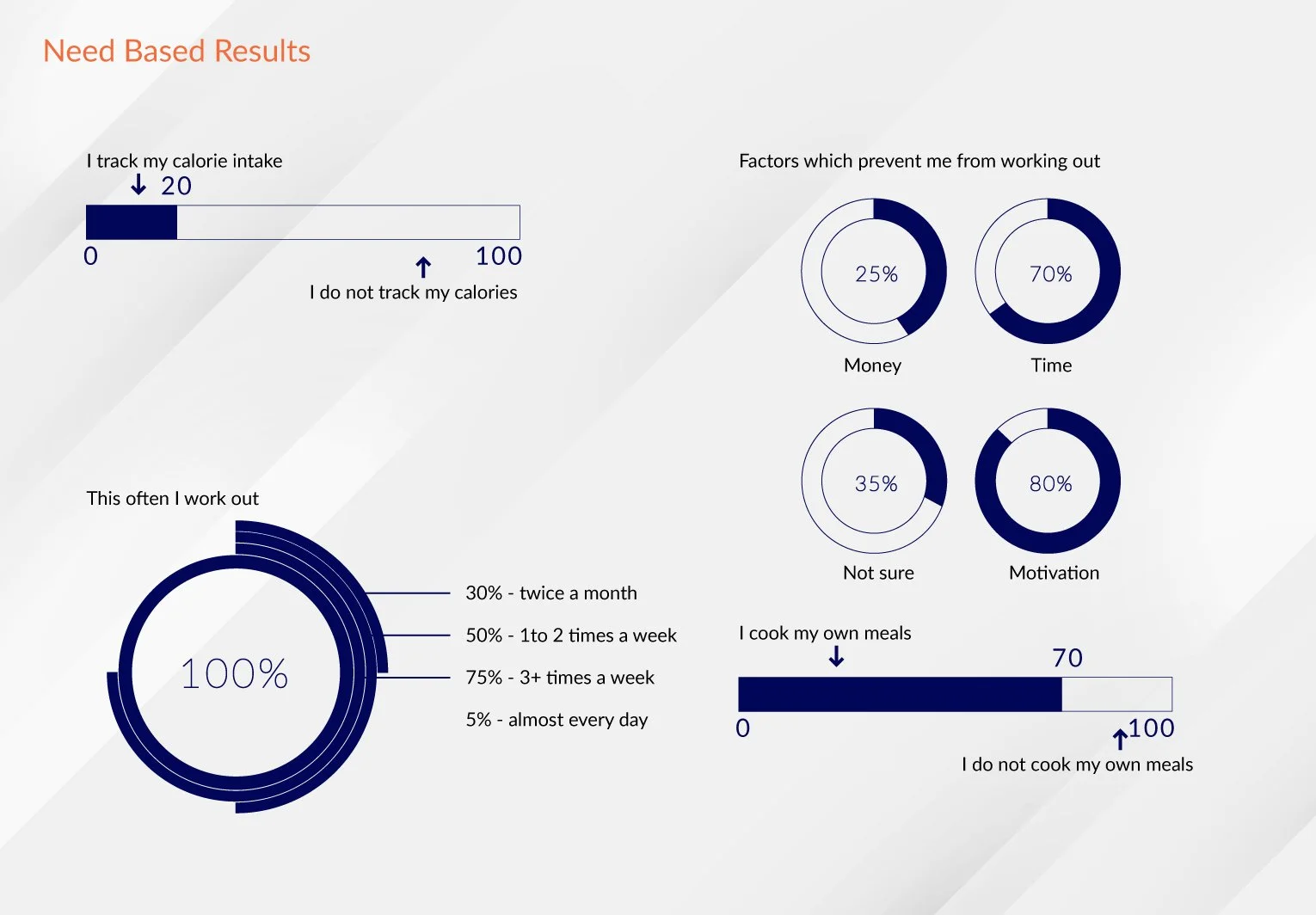
The majority (95%) wants to work out before starting work with the help of an app. 40% of the participants prefer a combination of a home app and going to the gym for some personal instructions, as the fitness app they use is not to their full satisfaction. User reviews and the fact that brand ambassadors and their friends use their apps lead them to use the app(s) they use. They all suffer from lack of time and motivation among different periods of times and they would love a companion to set goals together. They all prefer to not track any calories nor the nutritional facts of their daily consumption food but they would pay money to have this all put together for them in a plan that they can easily and effortlessly follow. The people who go to the gym have a personal trainer at their disposal (70% of the participants).
Empathy maps
Empathy maps, which are highly visual, should be now used so that we can pinpoint any gaps in knowledge or contradictions in research. Armed with this information, product designers can deliver more effective solutions or develop products that are more in tune with customer expectations.
Buyer persona development
The users mainly consist of: Casual Users and Fitness Enthusiasts. I created these segments based on each group's purpose, engagement level, and interactivity with other/similar products in the field. In order to obtain these segments, I have also looked at the ways their social interaction, motivations and what they wish to achieve with a fitness app that includes training and nutritional assistance.
User Stories
A user story is a short, simple description of a feature told from the perspective of the person who desires the new capability, usually a user or customer of the system.
In software development and product management, a user story is an informal, natural language description of one or more features of a software system. A user story is a tool used in Agile software development to capture a description of a software feature from an end-user perspective. A user story describes the type of user, what they want and why. A user story helps to create a simplified description of a requirement.
“As a working professional who spends a lot of energy in my profession, I want to have a fitness app, so that I can get a training sessions to work out my full body.”
GARRY GARDENER
“As a busy young professional who has limited time to prepare my meals and take care of my fitness, I want to use a fitness app that is easy & pleasant to use, so that I can be fit and not to worry about my meals.”
BRIAN BRAIN
“As a professional who manages a full-time job, I want to have an on my phone, so that I can get tips from a personal trainer and also tips about my nutritional intake.”
LILA LOYAL
“As a young professional who manages a full-time job and 2 kids, I want to spend as little time as possible to keep me fit and eat my meals, so that I can focus on my job and family.”
BRITTA BUYER
User Journey Map
A customer journey map is a visual representation or “timeline” of how a typical customer navigates a company’s marketing and sales funnels, including all the relevant touchpoints in all the relevant channels. The user journey mapping helped me comprehend basic information which then helped me form the design strategy of the project. Which are the problems that the users are facing when dealing with a specific list of tasks? This was the question that was always in mind and trying to think as my personas I was trying to invent ways of solving them while the users move along the many digital touchpoints.
The fact that those problems could be solved where enhanced with a user experience framework and in the end are forming little by little the product. More specifically its features which will turn out to be an enhanced version of the value proposition of the brand.
Design strategy
Executive intent
To add a wholesome and sustainable fitness goal in users’ lifestyles and enhance life quality by making a healthier lifestyle a habit with features like activity tracking, meal tracker sharing your milestones socially, creating goals as a couple to succeed those areas.
Target audience
Fitness enthusiasts & health conscious people. Age group of 18–45 years old.
General tasks
To download the fitness app and visit it every day
Subtasks
To track an activity/workout:
Activities like running/walking can be tracked in real-time and analytics can be viewed/sharedTo insert the meals the user consumes
To get social and interact with other community members
Features
Progress tracker: Analyze progress on a weekly basis
Meal calorie and nutrition counter
Technology constraints
Internet availability: Latest version of Android/IOS
installing the app to use it off internet
Cross channels
Android , iOS and Web app
Critical Success Factors
Providing motivational quotes and sharing user stories with common pain points and successes
Goal setting and progress tracking increases the engagement of the app.
Information architecture of the app
The app has to have a competitive advantage. From the plethora of the similar apps, this could come down to personalisation. People find it difficult to continue using similar apps, especially if they are not fit people they cannot find the necessary motivation. One of the edges the product could have is the creation of events from the community. The idea is to give to the community the power to initiate different kinds of events depending their own interests. This way the virtual communities could create a more powerful and over the time durable community and therefore digital product.
In the suggested structure of the app below this is reflected. In the design approach this has to be carefully approached so that it has the power of its own characteristic: the uniqueness per se.
Low fidelity wireframes
In this part of the product design process, a basic design of the app with the basic user flows is crafted. The intention is at this part to showcase the basic features of the app without using any of the colors decided to be used as the design system of the app, so that the testers of the app can better evaluate the features and focus on them. The usability test will highlight the most important barriers to reaching their happy paths and ideally will be an opportunity to openly discuss possible ways to better cover their needs. This part of the process, as tedious as it may be, is always essential towards creating a product that reflects the possible ways to both make the users realize that an app can cover needs they did not realize they had but also make the users wanting to join the app and therefore the community because they feel empowered with the right tools to solve their problems.
Usability test
I conducted a test on the lo-fi prototype to determine which user flows are complete and they offer an enhanced experience. To be more specific, the questions are the following:
Are the wireframes connected in a simulated navigational flow?
Users can proceed forward and backward within the flow?
Users can enter the flow from different starting points?
Are cues for navigation clearly indicated?
Is successful completion of the simulated activity clearly indicated?
Are users returned to an origin point after successfully completing the simulated activity?
User Test Planning – Goals & Methods
Objective:
To check whether the suggested user flow is offering a competitive advantage for the users of the fitness app
To verify that the user flow is flawless and the user/tester is not trapped in the screens
To explore possible features with the testers, after having some hypothesis stated at the beginning of the project
Research Questions:
Does the design complement the product?
Will the user get confused as they browse through the app?
Will the user successfully fulfill the tasks?
Will the interaction with the community make the experience overwhelming?
Will they complete a potential purchase/upgrade? If not, why?
KPIs:
The research goal is to find out whether the UX is good while using the app and in particular the time on task, the conversion rate, the user error rates, and one of the benefits of the use of the app covers the NPS so in summary we have:
Time on task
User error rates
Improvement opportunities because of the interaction with the testers
Participants:
8 people who speak English, and use an app to practice their workouts
4 male, 4 female, all aged 20-45 years old, 1 user of assistive technologies (keyboard, screen reader)
Incentive: a discount card to use for subscribing to the future app
The Tasks:
I conducted an unmoderated survey which included the following tasks to complete:
Introduction open-end questions/tasks (they appeared in a form of a questionnaire).
TASK: Browse through the app and comment while doing so.
What is your first impression?
Do you feel there is anything unique about what this app?
What are the key factors that influence your purchase decision and coming back to an app like this?
What are your biggest doubts or hesitations about this website? (nice to have – could be skipped)
Introduction open-end questions/tasks :
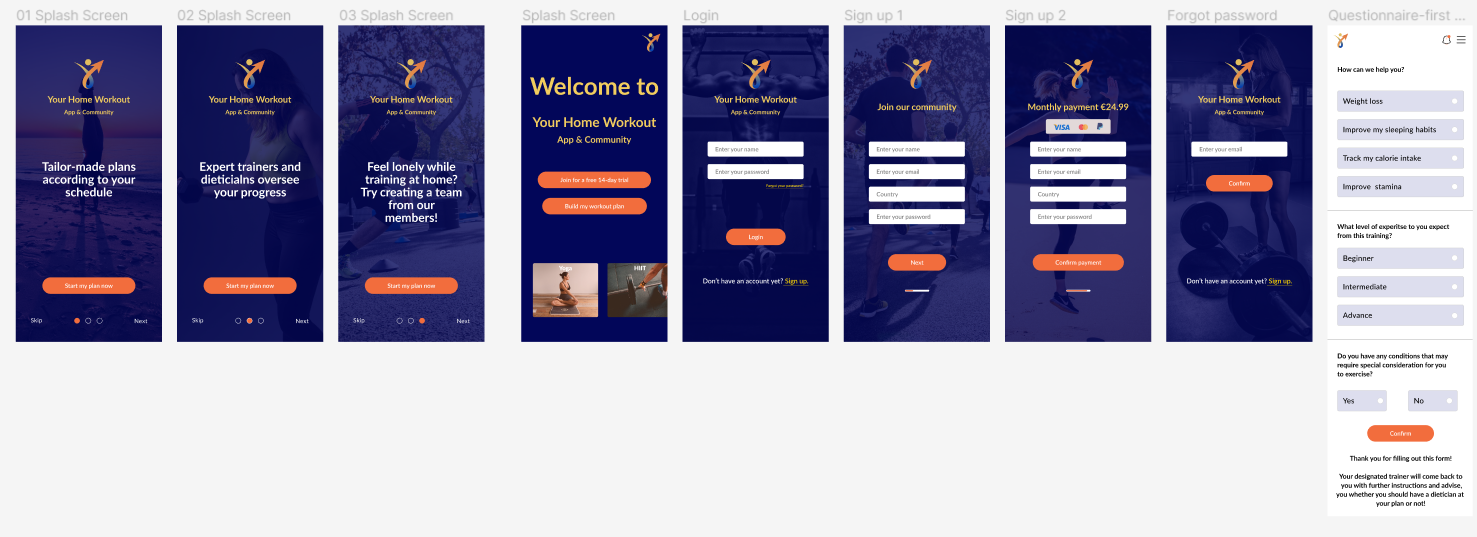
TASK: Check the splash screens and comment on those
TASK: Sign up
TASK: Fill out the questionnaire
TASK: Build your workout plan
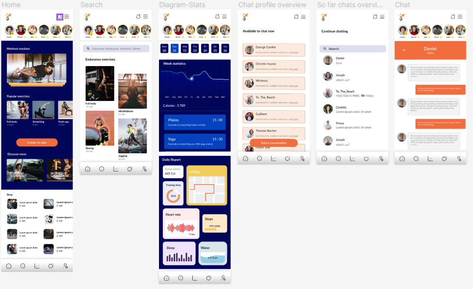
TASK: Navigate from “Home” to “Search”, from “Search” to “Diagram Stats”, from “Diagram Stats” to “Chat” and have a chat. From “Chat” to “Settings”
TASK: Use the side bar navigation and comment while doing so
After task questions:
Would you start an event by yourself?
Would you come back to use this app? Why ? Why not?
Would you like to see another feature on this kind of the app?
How do you feel about the colors chosen for this app?
From observations to insights
After organizing data, one can find themes. Identifying themes or patterns that are common across participants is one key element, but what makes a great researcher is coming up with insights based on the themes. Insight is an observation that helps understand the user or their needs from a new perspective. Insights are grounded in real data and answer the question we set before: how the results of the research will impact the design decisions.
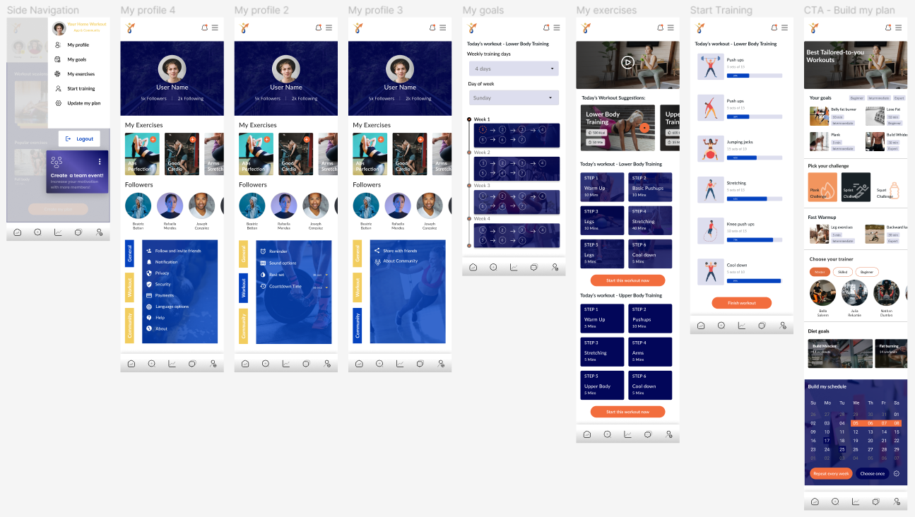
Below is the action plan for the changes that arose after the usability test:
On the “home page“ instead of having the views of the exercises to include the time to complete them
The exercise sets should have a way to put them in a favorite list and probably there should be an addition of “my favourite workouts“ to the navigation sidebar
To the “Diagram stats“ there should be a widget about the training time completed and mostly done activities
To the page “Available to chat now“, there should be a small description of the person with their basic interests
To the page “Build my plan“ there should be a trainers’ filter option together with the addition of a calendar so that the users can create repetitive and/or one-time workout plans.
High Fidelity wireframes
Based on the above insights, the low fidelity prototype is updated in Figma and you can find the high fidelity prototype here.
Accessibility considerations
Spacing in between text and in-between objects and clearly having navigation layouts that support an easy-to-understand kind of walk-through for users is of paramount importance.
Mobile accessibility follows web and web app best practices with a few special tweaks for mobile. Some of those include zoom access, properly tagging the hamburger menu and then things like large fonts, Bluetooth, keyboard access and large touch support, for making sure the CTAs are fat finger friendly. UI controls and navigation also need to be accessible for mobile – things like sliders, progress bars as well as custom controls like carousels and accordions. In this app, there are side bars and clearly stated CTAs, while the hamburger menu is clear and properly tagging the respective elements. In addition to this, the app is designed with a direction of having a rather dark menu, and with an attempt to avoid heavy loading times for SEO purposes, too.
Lessons learned
While working on this project, it was clear that this kind of an app has to have an edge to make it stand out from the rest which come out to an extreme amount even on a daily basis. I realized quite early that the interaction with the testers and the people that offered to review the wireframes were a huge contribution to the design process. I always want to leave room for the testers to express themselves and say what would they appreciate as features in the digital products. I also realized that the project would be really enhanced if another usability test was to take place. There are more additions that could prove to be beneficial for this project, such as the update plan overview and the creation of an event which would come later on to this app as an added feature because of the amount of app users (the pool of users which actually form the community).


